A tutorial for service.rmlmenu.jquery - Responsive Multi-Level Menu
November 14, 2014
Overview
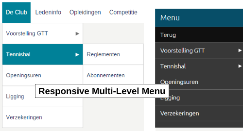
service.rmlmenu.jquery is a small jQuery plugin that offers a Responsive Multi-Level Menu. Using device queries in CSS it scales from a traditional multi-level dropdown menu on wide screens to a popup menu on smaller devices.
The layout/presentation of the popup menu part is completely inspired by the experimental drop-down menu that is published by codrops. See RESPONSIVE MULTI-LEVEL MENU. Full credit goes to them for what really is
...a responsive multi-level menu that shows its submenus in their own context, allowing for a space-saving presentation and usage...
To setup the menu all you have to do is to specify a div element for the popup menu button and create an unordered list inside another div element. Then, simply add the top menu items to the list. You can have as many sub-levels as you want by adding the necessary sublists to a list/menu item.
Demo
Click here for a demo.
Download
You can download the latest version of the plugin at GitHub.
Usage
To use the plugin start with adding the following in your header section (the component also makes use of the service.ontouchclick.jquery plugin so you have to include that one):
<link rel="stylesheet" type="text/css" href="[your-path]/service.rmlmenu.jquery.css" />
<script src="[your-path]/service.rmlmenu.jquery.min.js"></script>
<script src="~/Content/Libs/service.ontouchclick.jquery-1.0.0/service.ontouchclick.jquery.min.js"></script>
In your html, define a navigation menu as follows:
<!-- The 1st div is the container for the top Menu button that must be shown
when the horizontal navigation menu is hidden on small devices -->

<div id="popupMenuBttn" class="rmlpopupmenuButtonText">Menu</div>

<!-- The 2nd div holds all the menu items by putting them in a multi-level
unordered list -->

<div id="navMenu" class="navMenu">
  <ul>
    <!-- First menuitem with children -->
    <li><a href="#" title="Information menu">Info</a>
      <ul>
        <li><a href="/info/item1.aspx">Info item 1</a></li>
        <li><a href="#">Info item 2</a>
          <ul>
            <li><a href="/info/item2_1.aspx">Info item 2.1</a></li>
            <li><a href="/info/item2_2.aspx">Info item 2.2</a></li>
          </ul>
        </li>
      </ul>
    </li>
    <!-- Second menuitem without children -->
    <li><a href="/Sponsors.aspx" title="Sponsors menu">Sponsors</a>
    </li>
    <!-- Etc.. -->
  </ul>
</div>
Then, write some javascript to assign the
<script type="text/javascript">

  // Execute on page load
  $(function () {

    // Initialize navigation menu
    $('#navMenu').rmlmenu({
      // Menu options here:
      pMenuBttn: '#popupMenuBttn',
      pMenuBackText: 'Back',
      onPopupMenuOpen: function () {
        // You can do something here when the popup menu is opened
        $('#miniNav').addClass('showIcons');
      },
      onPopupMenuClose: function () {
        // You can do something here when the popup menu is closed
        $('#miniNav').removeClass('showIcons');
      }
    });

  });

</script>
That is all you need to have a multi-level menu that scales from a horizontal menu on wide screens to a popup menu on small screens. The breakpoint to go from horizontal to popup and vice versa is configured in the CSS file that comes with the plugin. You will find there device queries to show/hide the popup menu button (using class rmlpopupmenuButton and rmlpopupmenuButtonText). The plugin monitors the visibility state of the button to enable one of the 2 menu layouts.
Important
Be sure to specify href="#" in the anchor tag of each li that has a submenu, i.e. has a ul element. If you don't do that the horizontal menu will not be reliable on touch devices. In particular: when you tap on a 'menugroup' on touch devices the submenu will not pop up but instead the link will be invoked. The href="#" solution is chosen (instead of an approach using event.preventDefault) because it works reliable irrespective how many levels deep the menu goes.
Styling
The plugin comes with a CSS file that contains some basic styles for both the horizontal layout of the menu and the popup version of the menu.
- In case you want to style the horizontal menu different from how it is done in the plugin's CSS file, then you should have a look at the CSS file and in particul to the styles that have
rmlmenuas parent class. - To style the popup menu have a look at the styles with
rmlPopupPanelandrmlpopupmenuas parent class.
The first one is for the menu background panel that goes from the top of the screen to the bottom.
The second is for styling the menuitems inside the popup. - For styling the popup menu button the CSS offers 2 possibilities:
- The 1st one is when you assign class
rmlpopupmenuButtonto the popupMenuBttn div. In that case you must add 3 empty spans to the div. The button presents itself in 'hamburger' style without any text. - The 2nd one is when you use class
rmlpopupmenuButtonText. This shows like a real button with text inside. You must provide the text with the div.
- The 1st one is when you assign class
API
Initialization method
[jqObject(s)].flatcheckbox(options)
The options argument is a javascript associative array (an object with key/value pairs) that allows you to initialize the plugin with some properties.
Properties
pMenuBttnType:
String
Default:"popupMenuBttn"
This property defines the jquery selector string to control the popup menu button.
pMenuBackTextType:
String
Default:"Back"
This property specifies the text that has to be shown in the top 'Back' menu item when a submenu is active. It only applies to situations where the poup menu is shown.
pMenuTitleType:
String
Default:"Menu"
When the navigation menu is shown in the form of a popup menu a title is shown at the top of the panel. This property allows you to specify this title.
onLevelClickType: callback function
Signature:onLevelClick: function (el, name) { }
el: The<li>DOM element that was clicked/touched.
name: The text of the first anchor child elemen of the above list element.
This callback is only occurring in situations where the popup menu is active. It is then called when the user clicks on a menu item which has a submenu.
onLinkClickType: callback function
Signature:onLinkClick: function (el, event) { }
el: The<li>DOM element that was clicked/touched.
event: The browser event that has been raised as a result of click/touch.
This callback is only occurring in situations where the popup menu is active. It is then called when the user clicks on a menu item that has a real anchor action attached.
When you provide this callback you must return eithertrueorfalse: when you returnfalsethen the component will, as expected, trigger the URL that is defined for the menu item; when you returntruethen the component assumes that you took care of the action and so the URL is not invoked.
onPopupMenuOpenType: callback function
Signature:onPopupMenuOpen: function () { }
This callback is called when the poupmenu is opened.
onPopupMenuCloseType: callback function
Signature:onPopupMenuClose: function () { }
This callback is called when the poupmenu is closed.
Other methods
None.